Building a Tree Equity Map
Creating a Tree Equity Map for Calgary meant bringing together diverse datasets—tree canopy, census demographics, and urban heat. This post walks through the analytical and technical steps I took to transform raw data into an interactive tool that highlights areas most in need of increased tree cover.
Trees are more than just greenery—they’re part of the urban infrastructure. They cool our streets, soak up stormwater, and improve mental health. But not all neighborhoods have equal access to the benefits of trees. A common trend across many North American cities is that neighborhoods with high populations of immigrants, visible minorities, or low-income residents often have the lowest distribution of urban trees and miss out on their benefits. The idea that all communities within a city have access to the benefits of trees is called Tree Equity.
Organizations such as American Forests have pioneered work in understanding Tree Equity and developing a social equity and environmental justice lens to address it. They developed the Tree Equity Score, which quantifies whether there are enough trees in a neighborhood and what populations are most affected, and mapped these results for the United States. The City of Toronto adopted the same equity measure in 2024 to help them plan where to plant trees in the city.
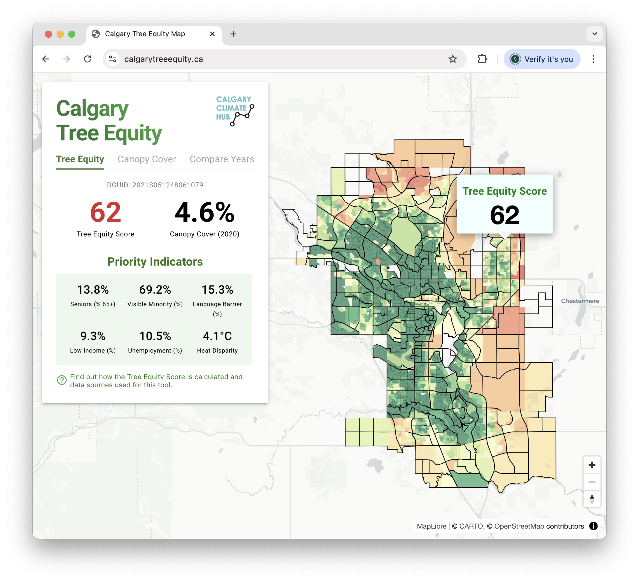 Mapping tree equity score and priority indicators in Calgary. https://calgarytreeequity.ca/
In this post, I share how I created a Tree Equity Map for Calgary using local data sources and community indicators. While I drew on the methodology developed by American Forests, I adapted it to Calgary by integrating Canadian census data and high-resolution tree cover data from the City’s Open Data Portal. The takeaway is clear: by combining diverse datasets, we can identify communities most impacted by low canopy cover and better target urban greening efforts where they’re needed most.
From Canopy to Equity: Building on Earlier Work
I wrote a previous post about mapping tree canopy cover in Calgary using a combination of satellite imagery, canopy height mapping (CHM), and LiDAR. The results were striking—some neighborhoods in the northeast had virtually no tree cover, while older communities were shaded by canopies. Building on that work and supporting the Calgary Climate Hub, I wanted to take that work a step further by combining canopy coverage with demographic indicators and map tree equity.
Data Sources and Methodology
American Forests has a detailed description of their methodology, which is generalized for a variety of biomes in North America including forest, grassland, Mediterranean, or desert environments. The biome helps inform the baseline canopy target for a region and can range between 15% (desert) to 40% (forest). The target is then adjusted by considering building density where regions with more buildings have less area to plant trees.
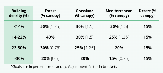
Canopy target considering biome and building density. Source: American Forests
As of 2024, Calgary’s tree canopy was at 8.25%. Canopy goals vary depending on which policy document you read. The Calgary Climate Strategy, Pathways to 2050 states a goal of 10% by 2030, 16% by 2050, while the 2023-2026 Climate Implementation Plan aspires to 14-20% by 2058. 16% is often cited as the target so that’s what I used for the Calgary Tree Equity Score.
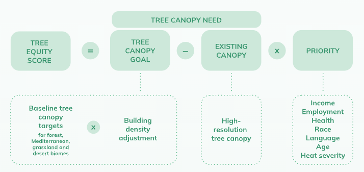 Tree Equity Score formula. Source: American Forests
To create a Tree Equity Score using the American Forests methodology, I needed three sources of data: tree canopy coverage, census data (priority indicators), and land surface temperature (heat disparity). You can also refer to the jupyter notebooks to see all the data sources and analysis in detail.
Canopy Data
The City of Calgary’s open data portal has consistently provided high-quality datasets that I’ve used over the years for urban analysis. Their tree canopy data is a high-resolution, LiDAR-based dataset spanning from 2012 to 2022, ideal for calculating canopy coverage (i.e., the percentage of a neighborhood covered by trees) as well as temporal analysis. The City also offers orthophoto imagery dating back to 1926, which is valuable for ground-truthing and verifying changes in tree canopy over time. With a resolution less than 1m, compared to satellite imagery which could have a resolution over 10m, orthophoto provides the greatest level of detail for this type of analysis.
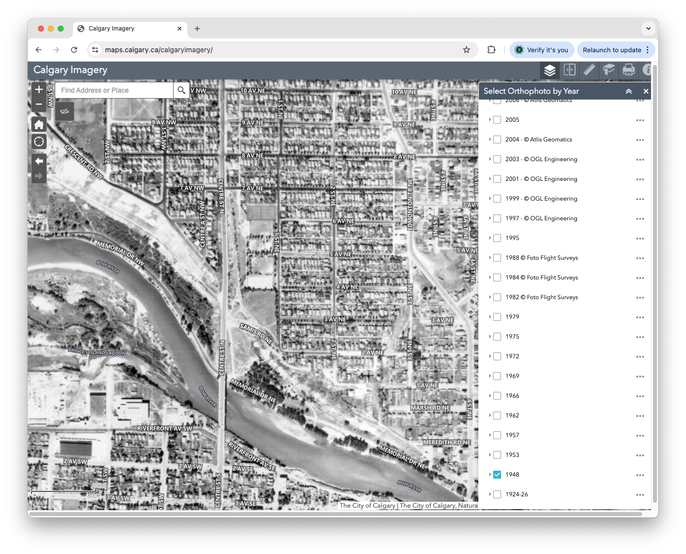 City of Calgary 1948 Orthophoto
Census Data
The Priority Index used in American Forests’ equity score is based on the “American Community Survey 2017–2021” and is available for every Census Block Group in the U.S. Statistics Canada collects similar data (except for the Health Burden Index) and released it for the 2021 Census covering Dissemination Areas. Accessing census data through APIs was tricky at first—I wasn’t familiar with the SDMX (Statistical Data and Metadata eXchange) standard that Statistics Canada uses. However, they provide a guide and support for working with their APIs. The pandasSDMX library was also helpful in downloading and transforming the data I needed. For the 2021 Census Profile, I used the following indicators, aggregated from multiple characteristics (see the Jupyter notebook for more info):
- Proportion of seniors (65+) and children (0–4)
- Visible minorities
- Language isolation (no English or French spoken)
- Low-income households
- Unemployment rate
Land Surface Temperature
To capture the urban heat island effect in the priority indicators, I used surface temperature data from Landsat Collection 2 Level-2. The surface temperature product is derived from the Thermal Infrared Sensor (TIRS) and provides temperature data at a 30-meter resolution.
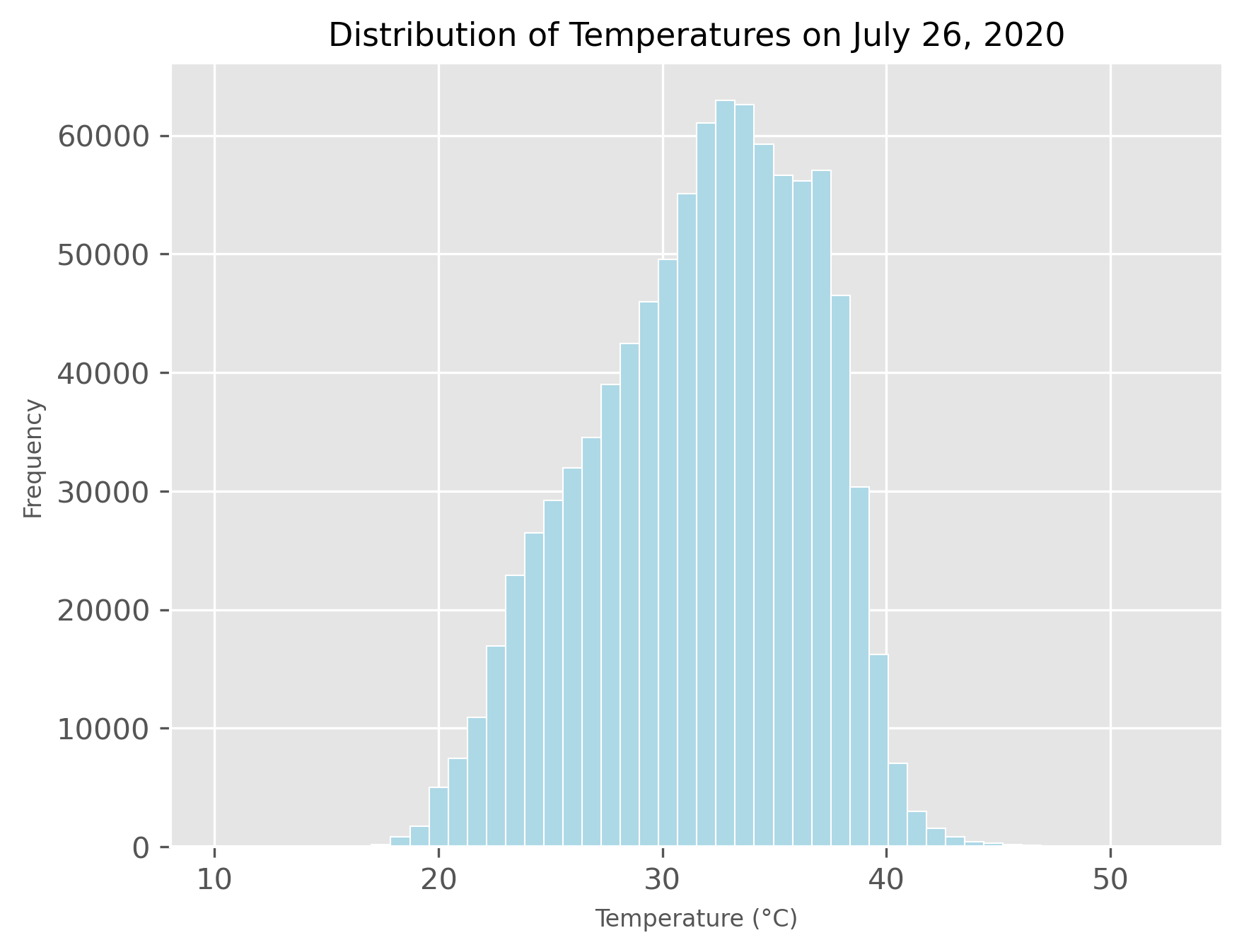 Histogram of surface temperatures in Calgary on July 26, 2020.
I used Planetary Computer’s STAC API to search the Landsat collection for a cloud free day in summer 2020. July 26 seemed to be the best selection with satellite coverage over the entire city. To determine heat disparity for the tree equity score I then averaged the temperatures across the entire city and determined the difference between each individual dissemination area.
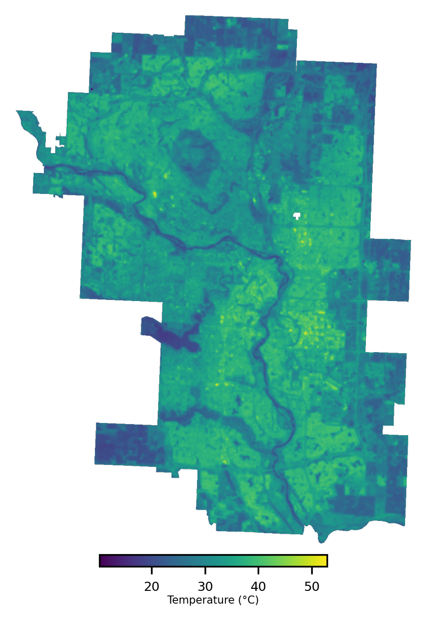 Land surface temperature map of Calgary for July 26, 2020.
What the Map Shows
Combining it all together, I built an interactive map using MapLibre for rendering vector tiles, PMTiles for efficient, lightweight vector data storage and access, and React for the UI. GeoPandas, rasterio and other data analysis libraries were used to process the source datasets and generate aggregated metrics.
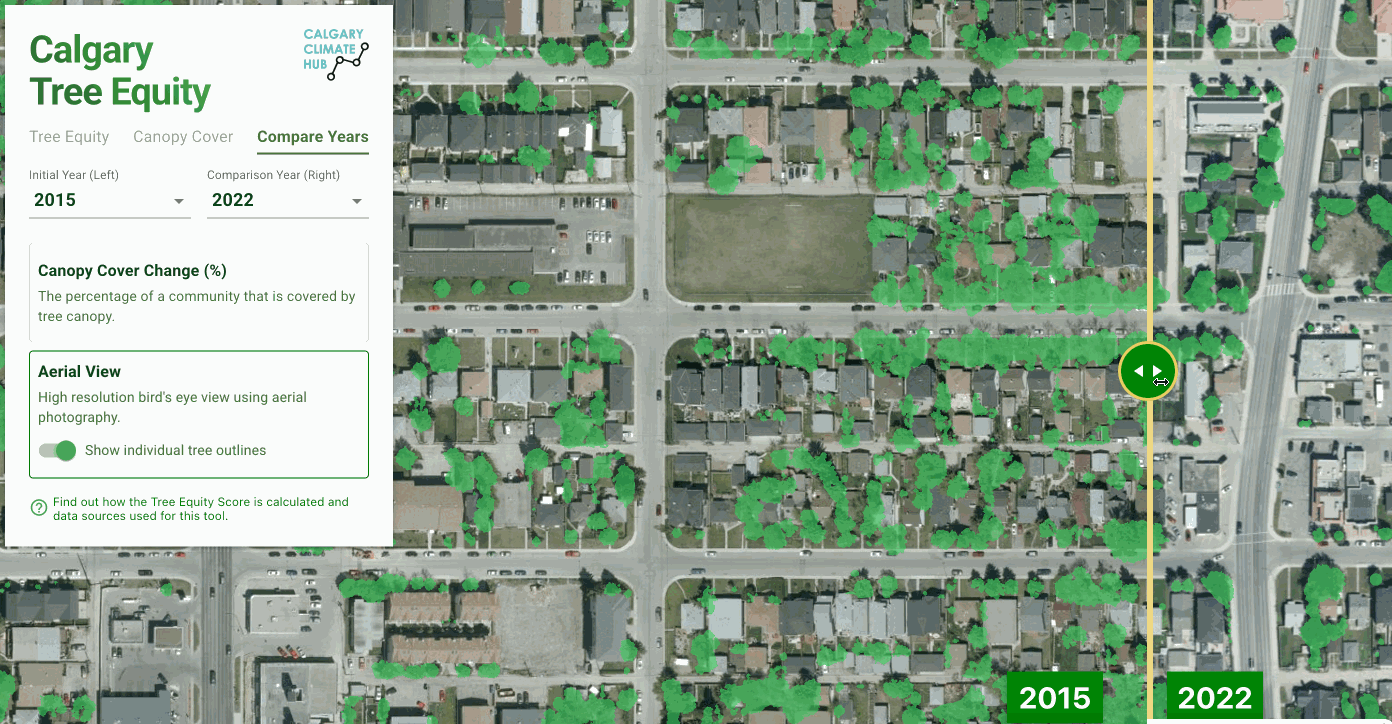 Comparing tree canopy across years.
The map allows users to zoom in to specific neighborhoods and explore tree equity score, canopy coverage and priority indicators. The temporal analysis tool lets users compare tree canopy between years while simultaneously viewing historical orthophoto imagery. This makes it possible to see not just where trees are today, but how tree coverage has changed over time.
Final Thoughts
By combining local data and established methodologies we can create tools that not only inform policy but also empower residents and advocates. The Calgary Tree Equity Map is a step toward that vision, and I hope it inspires further action to grow a greener, fairer city.