Energy Consumption Modelling for Electric Bus Schedule Design
Designing a schedule for electric buses takes more than simply replacing the same service delivered by diesel buses. Due to range limitations of EVs, understanding how battery state of charge changes over a route is important. In this post I introduce a way to determine energy consumption metrics using a visualization tool that uses the Drivecycle python package.
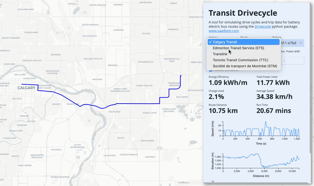 Screenshot from Transit Drivecycle visualization.
As Canadian transit agencies work furiously to take advantage of a gusher of federal funding to support Zero Emission Bus adoption, more attention is being paid to the practicalities of implementing these technologies. Compared to conventional diesel buses, the range limitation of battery electric buses for example, make their implementation a little more challenging. It’s typical to see more battery electric buses deployed to meet the same scheduling requirements of a fleet of diesel or gasoline buses. The main reason for this is the inefficiency in implementing the same service since schedules must be redesigned to conform to the range limitations of electric buses. Therefore, it’s likely that maintaining the same service would cost more due to increased operating costs.
![]() Ottawa’s OC Transpo was one of the latest transit agencies in Canada to announce a plan to transition to battery electric buses. Image Source: masstransitmag.com
Ottawa’s OC Transpo was one of the latest transit agencies in Canada to announce a plan to transition to battery electric buses. Image Source: masstransitmag.com
While I was working on the electric bus program at Calgary Transit, I was interested in how the range considerations of battery electric buses contribute to the transition from existing service schedules. The basic concept behind this is determining the energy drawn from the battery as it completes its route. I wrote an article about developing a method to simulate a bus drivecycle using open source mapping data from OSM and route data from Transitland. It provided a way to estimate a vehicle drivecycle without having to collect telemetric data (i.e. GPS coordinates). Since then, I’ve further expanded the concept by developing a Python package called Drivecyle that uses trajectory planning algorithms to create sample vehicle drivecycles along with the energy consumption. You can read more about the details of Drivecycle and the assumptions that go into it here.
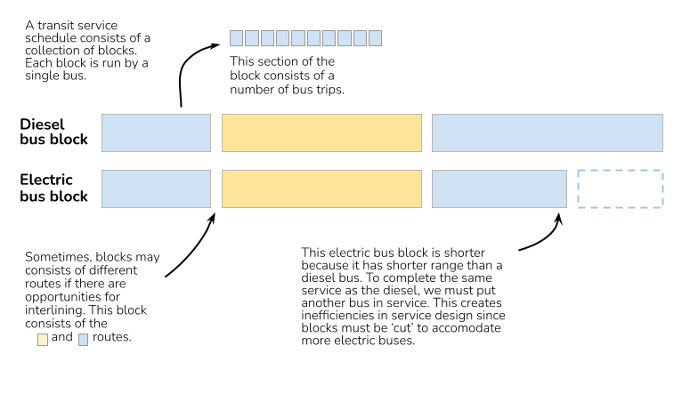 What is a transit block? A block can be looked at as the “day in the life” of a bus. It’s a collection of trips taken by a single bus.
Designing an Electric Bus Schedule
When we take transit schedules driven by diesel buses and convert them to electric, it’s often not as simple as replacing one diesel bus with an electric bus. Depending on the range of the block, sometimes we may be required to re-block to ensure the electric buses can complete the same service. This is where predicting energy consumption and battery state of charge (SoC) is important. A number of factors can affect energy consumption, such as weight of the bus (i.e. number of passengers on board), elevation change or regeneration ratio (i.e. converting braking force back to battery charge), speed and number of stops.
I created an online tool called Transit Drivecycle that can show the estimated energy consumption and energy efficiency in kWh/km for various transit agencies in Canada. The user can manipulate variables such as bus weight, auxiliary power (i.e lighting and heating), frontal area or battery capacity and see how the energy consumption changes. Although this is a very simplified analysis compared to when transit planners would look at block schedules, it provides an estimate of how a route or single trip would preform if it was electrified. Further advancement of the visualization tool may include estimating energy consumption at the block level by aggregating a number of trips.
One of the advantages of using Drivecycle for this project is that is uses open source mapping data from OSM which can provide us with speed and intersection data instead of collecting and processing GPS data. It provides a way to quickly scale the generation of simulated driveycle data for an entire transit bus network using limited resources.
![]() Screenshot from Transit Drivecycle visualization.
Screenshot from Transit Drivecycle visualization.
Transit Drivecycle Technical Notes
Check out the github link to the transit driveycle repository. The visualization tool is currently set up as three docker containers: Valhalla for the routing engine, FastAPI to serve the Drivecycle data and a frontend using React. I also used this as an opportunity to test out Maplibre since it was released following the Mapbox licensing change. The transit data is retrieved from Transitland however I’m working on a way to include a local GTFS database to make all services containerized. The containers were deployed to Azure Container Instance using the new Docker integration.