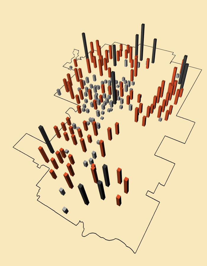
3D Mapping – Visualizing Population Data
Since the City of Calgary began releasing open data through the online catalogue I’ve been trying to come up with an interesting way to represent and visualize census data. It’s often difficult to represent something as boring as population and demographic data in a compelling way. The City of Calgary’s own census page presents the data in pages and pages of tables and graphs.
I thought it might be interesting to visualize the data on a 3D representation of a map. I decided to work with population data for each community in Calgary, visually displaying the data something like high rise buildings. Many of the “highest” populations are in suburban communities like Evergreen, Coventry Hills or Auburn Bay - areas that ironically, are void of any high density employment nodes.
I developed the visualization following the GeoJSON map I created earlier. The idea to use a 3D representation was inspired by recent tutorial videos by Daniel Shiffman on the Coding Train using WebGL. I found this project to be a good exercise in understating the different considerations when working in 3D and the use of translations and rotations in X,Y,Z axis.